GetVoIP has released a new free font called Grotesque that is optimized for web use.
Grotesque is an open-source, sans-serif typeface designed to provide a clean, modern, and minimalist look for web pages.
With its geometric styling and excellent legibility on screens, Grotesque aims to be a versatile web font.
With weights from thin to black, support for multiple languages, and both uppercase and lowercase letters, Grotesque can be used in a variety of web design projects.
Its wide range of weights allows designers to maintain a visual hierarchy through bolder headers combined with lighter body text.
The generous spacing and proportions make Grotesque readable at both small and large sizes.
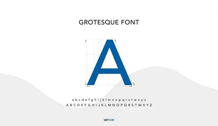
About the Grotesque Font
Grotesque was designed by GetVoIP’s in-house designers as a free and open-source font optimized for screen use. Here are some details about Grotesque:
- Sans serif, geometric, minimalist style
- 7 weights from thin 100 to black 900
- Optimized for web use on screens
- Contains full set of uppercase and lowercase Latin characters
- Supports over 75 languages using Latin script
- The open license allows free use for any purpose
- Can be downloaded from GetVoIP’s website and GitHub
The Grotesque family provides a versatile, legible sans serif font with a modern look suitable for headlines, text, and display usage.
Its minimal form and wide range of weights make it flexible for web designs.
Benefits of Grotesque Font
Here are some of the benefits of using Grotesque font for web designs:
- Legibility at small sizes due to generous proportions, spacing, and simplicity
- Seven weights allow visual hierarchy through headers and styling
- Geometric, structured letterforms give a modern, techy look
- Form and spacing optimized specifically for screens
- Available as web fonts with @font-face implementation code
- Usage rights allow embedding in websites and products
- Complements a wide range of webpage layouts and styles
- Gives a consistent, branding-friendly look across the webpage
- Clean aesthetic appropriate for professional websites
Using Grotesque Web Font
Here is a quick guide to using Grotesque web font:
- Download Grotesque font files from GetVoIP or GitHub.
- Add font files to your web project files and CSS.
- Use the @font-face rule in CSS to define Grotesque as a web font.
- Apply font-family “Grotesque” and the weights needed to CSS selectors.
- Set font size, line height, etc. Grotesque works well from 12px to 96px.
- Use weights from thin to black for typographic hierarchy.
- Combine with system fonts as a fallback for broader support.
Grotesque Font in Web Design
Grotesque can be utilized in web designs in various ways:
- Headlines – Bold weights used for headlines provide impact.
- Text – Lighter weights work well for body text for readability.
- Navigation – Use medium weights for clean navigation menus.
- Icons – Complement with glyph icons or shapes. Avoid intricate icons.
- Imagery – Pair with bold, geometric-style imagery. Avoid highly detailed photos.
- Color – Monochromatic color schemes reinforce a minimalist look. Avoid overly vibrant palettes.
- Layout – Use plenty of negative space for a clean layout. Avoid cluttered designs.

Styling Tips for Grotesque
To effectively utilize Grotesque in your web designs, consider these styling tips:
- Create a strong typographic hierarchy – heavier weights for titles, medium for headers, regular for text
- Add ample line height (1.6em+) for improved legibility
- Increase letterspacing slightly for headlines to aid scans
- Maintain adequate padding/margins around blocks of text
- Enable font smoothing for crisper edges on retina displays
- Set base font size to 16px or larger for readability
- Constrain the max-width of paragraphs to avoid lengthy lines
- Pair with a simple modern serif like Lora for nice contrast on certain pages
In summary, Grotesque provides designers with a versatile new sans serif choice for clean, readable websites.
Combined with thoughtful typographic treatments, it elevates and modernizes website designs.
Conclusion
Grotesque offers a versatile new sans-serif choice for crafting clean, readable websites with a modern vibe.
Its techy geometric styling, range of weights, and legibility make it a great addition to any web designer’s toolkit – especially those seeking a minimalist aesthetic.
Combined with smart typographic treatments, Grotesque can elevate and lend an elegant touch to all types of sites and digital products.
Frequently Asked Questions (FAQ)
Ques 1. What file formats is Grotesque available in?
Ans. Grotesque comes in WOFF2, WOFF, TTF, and OTF formats to support all major browsers and usage cases.
Ques 2. What languages does Grotesque support?
Ans. Grotesque supports over 75 Latin script languages making it usable across Western Europe, Americas, Africa, etc.
Ques 3. Is Grotesque free for commercial use?
Ans. Yes, Grotesque is licensed under SIL Open Font License which allows unlimited free use for any purpose including commercial.
Ques 4. Does Grotesque work well with serif body text?
Ans. Grotesque headlines pair best with sans-serif body text. But serif text can provide a nice contrast if styled well.
Ques 5. What other fonts pair well with Grotesque?
Ans. Other modern/minimalist sans serifs like Roboto, Montserrat, Oxygen, and Lato complement Grotesque nicely in designs.